- 5.0
- Since 2010
- GTA +100Km
Pattern, joint width, offsets, edges, and grout tone change how a room feels. Use this guide to pick with confidence, then start your estimate.
Each pattern creates a different feeling and has specific installation considerations. Select a pattern below to see details and guidance.

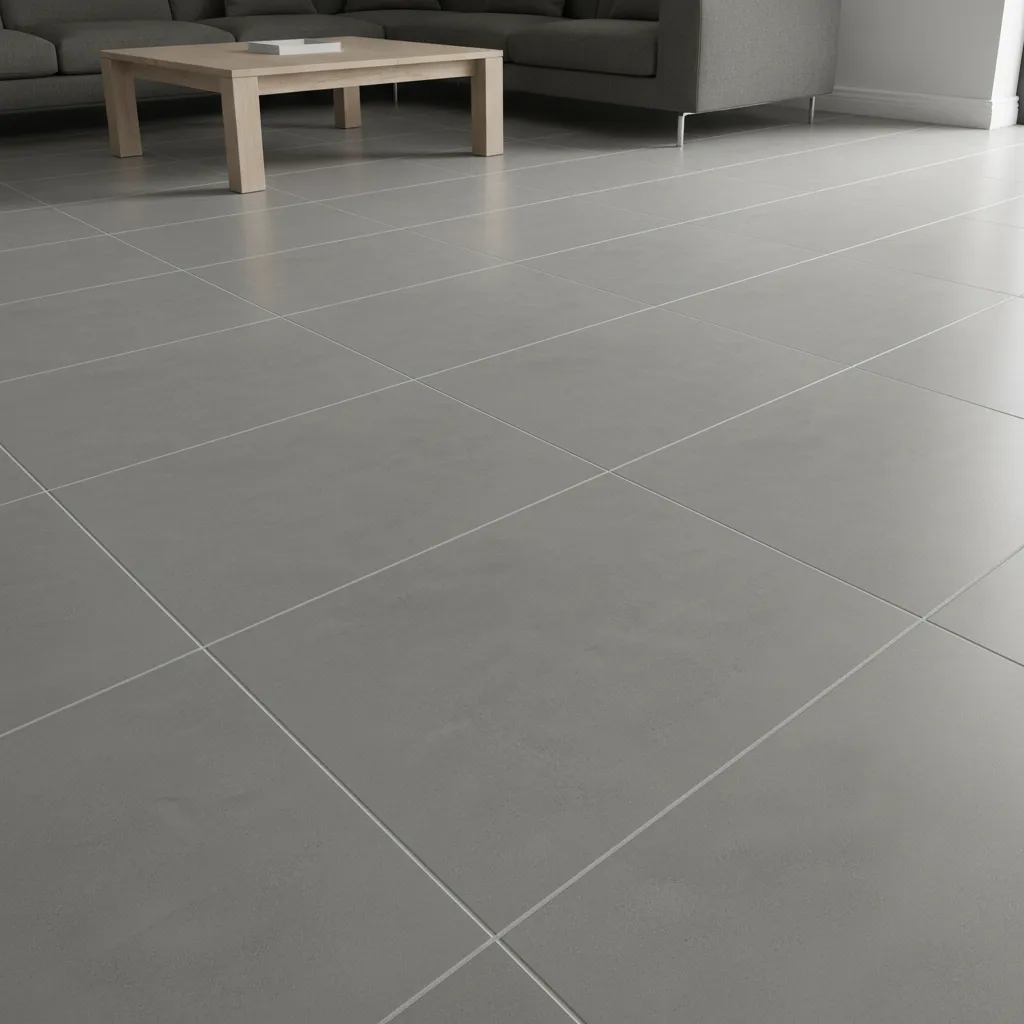
Modern, crisp lines that show levelness
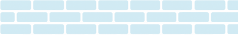
Classic offset pattern


Texture and visual grip
Blends seams with sheet staggering. Excellent for adding texture and slip resistance.
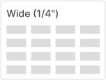
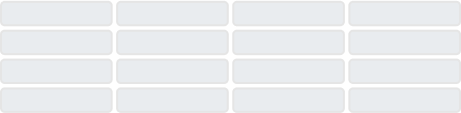
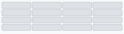
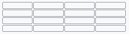
Joint width affects both look and installation tolerance. We’ll recommend the right width based on your tile size, calibre, and aesthetic goals.
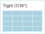
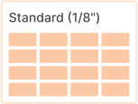
Tighter joints = Cleaner lines
Require truer tile and flatter substrate
Wider joints = More forgiving
Can add character or match rustic styles
Need help choosing the right joint width for your project?
To reduce lippage on larger rectangles, a 1/3 offset often looks better than 1/2. For very long tiles, minimal offset with straight lines can be the calmest look.


Lippage Control: Smaller offsets reduce the appearance of height differences between tiles
Visual Flow: Different offsets create different movement patterns across the surface
Tile Size: Larger tiles benefit from smaller offset percentages

Large format tiles with 50% offset — notice the reduced visual impact of joint lines
Traditional brick pattern
Equal offset creates classic look
Reduced lippage pattern
Less noticeable joint alignmen
Grout colour dramatically changes how your tile looks. Choose blend for seamless flow, mid-tone for balance, or contrast to make your pattern pop.
White subway with light grey grout — quiet, seamless

White herringbone with dark grout — pattern forward
Test First
Always test grout colour on a sample area or spare tiles
Consider Maintenance
Lighter grout shows dirt more; darker grout hides wear better
Room Size Matters
Contrast can make small spaces feel busier; blend opens them up
Pattern Emphasis
Contrast highlights pattern; blend emphasizes tile itself
How you finish tile edges affects both appearance and durability. The right edge treatment creates clean transitions and protects your investment.
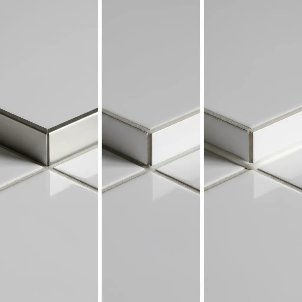
Where tile turns a corner or meets paint
See how different patterns, grout tones, and finishing details work together in actual installations. Each combination creates a unique look and feel.
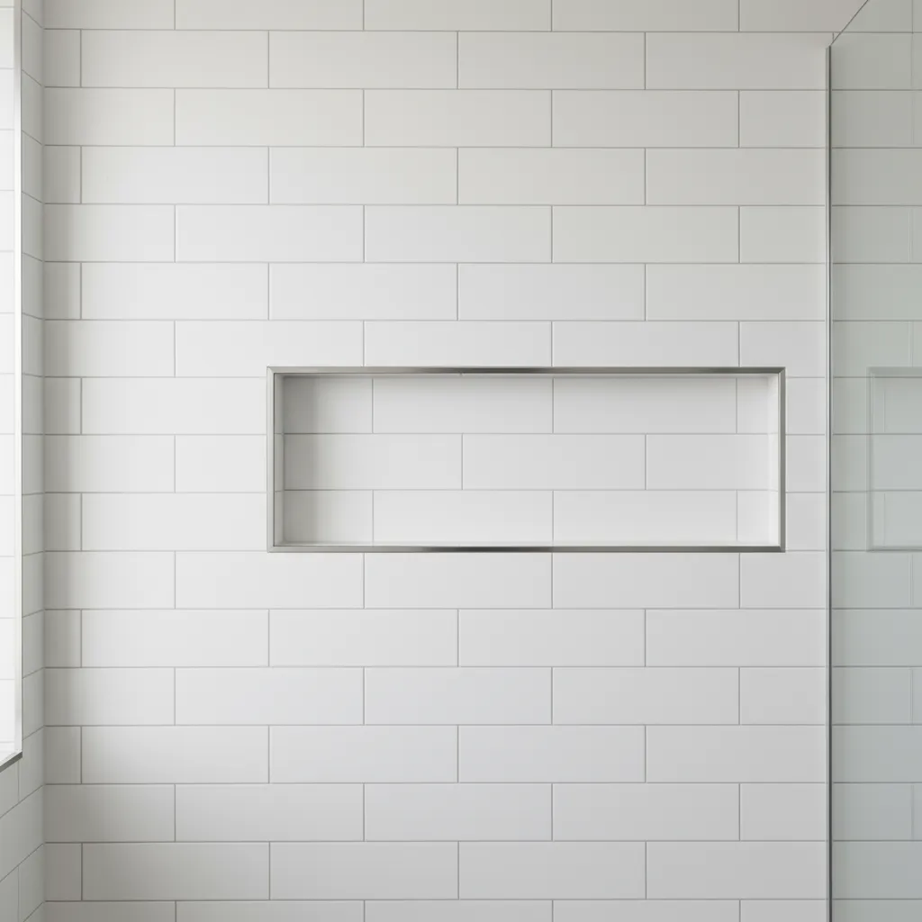
Large format grid creates an architectural, seamless feel
Clean, seamless appearance
+ Blend Grout
Architectural, minimal
+ Tight Joints
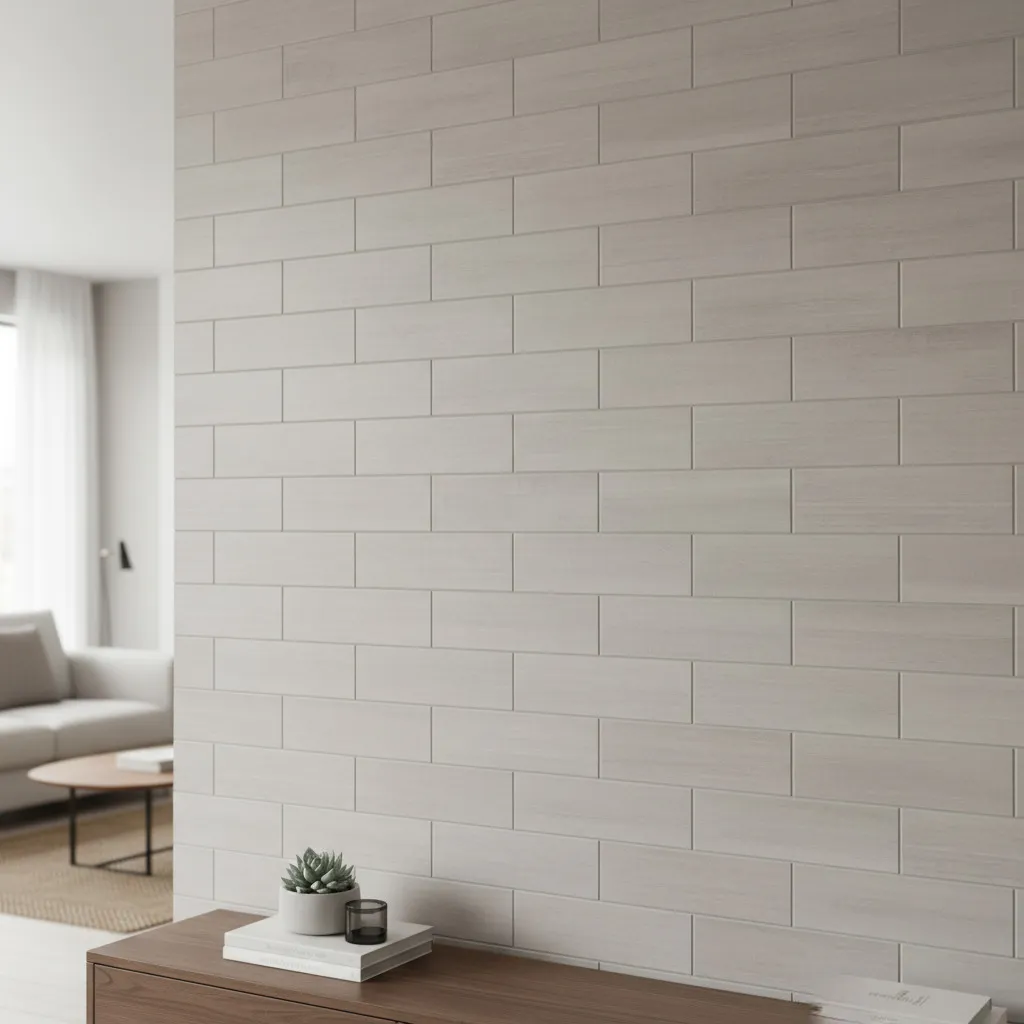
Timeless, versatile
+ Mid-Tone Grout
Statement, character
Send us photos of your space and dimensions of each area — we’ll help you get started ASAP
Common questions about choosing patterns, grout colours, joint widths, and edge finishing for your tile project.
| Pattern | Best Grout | Joint Width | Edge Finish |
|---|---|---|---|
| Stacked Grid | Blend/Mid-tone | 1/16" - 1/8" | Profiles |
| Running Bond | Mid-tone | 1/8" - 1/4" | Bullnose/Returns |
| Herringbone | Contrast | 1/8" - 1/4" | Profiles |
| Large Format | Blend | 1/16" - 1/8" | Profiles |
| Mosaic | Blend/Mid-tone | 1/8" | Silicone |
Common questions about choosing patterns, grout colours, joint widths, and edge finishing for your tile project.
Should I choose blend or contrast grout?
What's the best pattern for large format tiles?
How do I choose joint width?
Do I need edge profiles?
Can you help with pattern and grout selection?
What's the difference between patterns for small vs large tiles?
Still deciding? Send us photos and inspirations for personalized recommendations.